| alex26, trainspotter - LGs, Jean-Philippe SL, Santpoort-Noord and 18 other liked this |
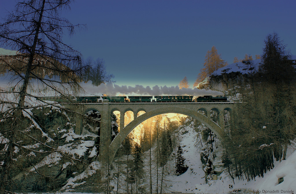
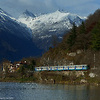
Stunning composition with that wonderful lighting
I am very sorry, but I cannot like this. This is a pretty cruel way of manipulating a picture. The blus sky was just copied in the picture, technically not very skilled (left top). I suppose it would have been lovely without that blue manipulation. Sorry for that feedback.
The blu sky is not been copied in the picture my dear friend ...but enhanced whit progressive blue tint (PICASA)..that's all i've done..!!
That is true... copied in, faded in, enhanced in with "progressive tint", whatever. The blue sky did not belong to scenery and you put it in. My comment should have been a constructive criticism on your picture. I definitly like the scenery and the steamer, but why should one alienate this? I am sorry for not meeting your comment expectations.
Please log in to your account or sign up to like this picture or leave a comment


